
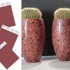
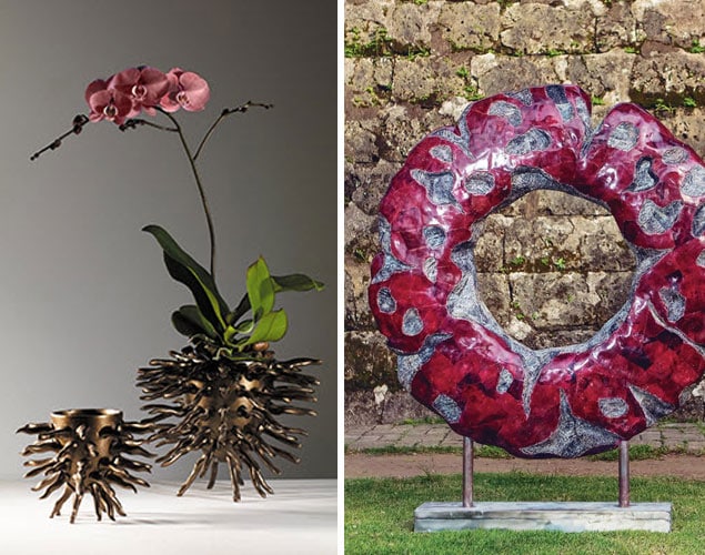
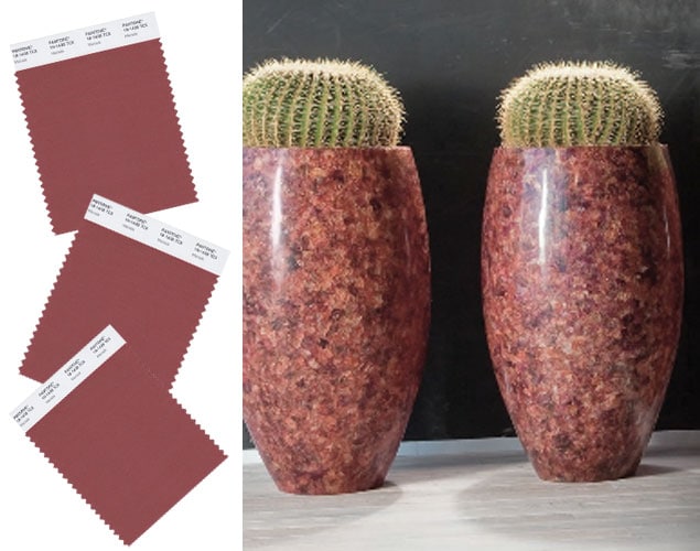
Pantone’s 2015 color, Marsala succeeds in capturing the emotional concept of color, proving to be both impactful as well as elegant.
The color has been chosen as it will “enrich our mind, body and soul, exuding confidence and stability” according to Pantone Color Institute executive director Leatrice Eiseman. Eiseman states: “Much like the fortified wine that gives Marsala its name, this tasteful hue embodies the satisfying richness of a fulfilling meal while it’s grounding red-brown roots emanate a sophisticated, natural earthiness.”
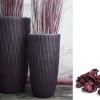
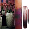
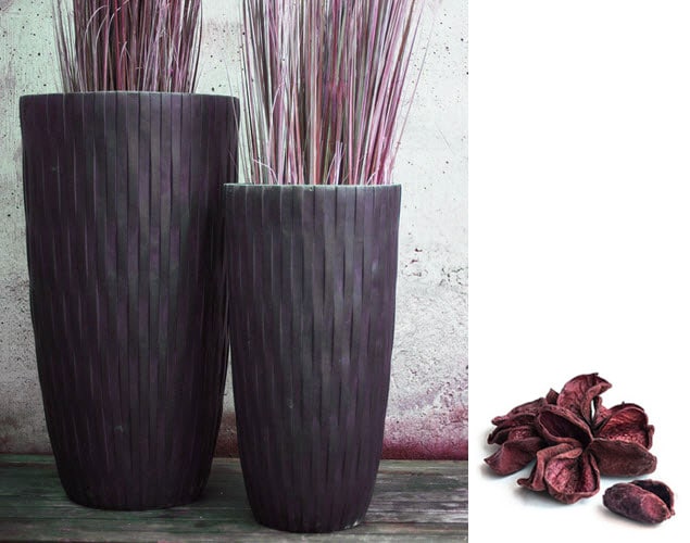
The strength of this color lies within its versatility and can be when used on its own or as a strong accent to many other colors. It can be either bright or low key, matte or gloss. Harmonizing the palette when used as a layered color, look for it in textured, monochromatic patterns. Easily paired with metallics of bronze, umber and copper as well as complimenting the spectrum of teals, blues and greens. Combined with the surrounding hues of spicy orange, amber and fiery reds, Marsala picks up a vivacious earthiness that both softens and deepens the palette.
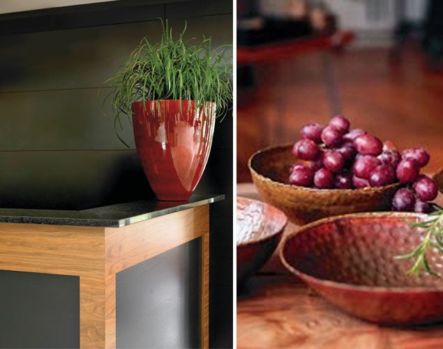
For the interior, Marsala will prove “complex and full bodied without overpowering” and has the ability to unify space by adding elegance through paint and texture. Look for it as a detail used in accessories, accent colors and décor. The color is enhanced when applied to textured surfaces making it a smart choice for rugs, textiles and upholstered furniture.
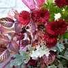
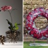
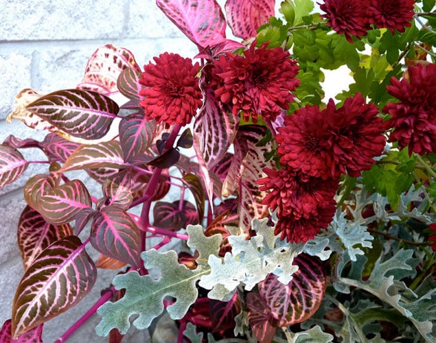
In floral design, expect to see Marsala center stage in wedding and event décor as a focal color as well as an accent color contrasting other hues and tones. This warm and rich shade will bring an air of sophistication to the palette and pairs well with bright pastels and blush tones.
The grounded influence of Marsala’s earthy hue may be just what we need in 2015. With its undertone of rootedness, this nurturing color feeds our soul and speaks to the robust, intrinsic power that animates the life force that surrounds us.